Material, Memory, and the Language of Surface
Sarah Finucane moves fluidly between design and intuition, crafting contemporary artworks that reveal as much as they conceal. Each painting merges material, gesture, and time into a unified surface—an accumulation of choices and erasures where memory becomes inseparable from form. Her years as a Fortune 50 creative director sharpened her visual clarity and discipline, qualities that infuse her compositions with both restraint and vitality. Every mark feels intentional, yet alive, carrying the echo of what preceded it. The result is imagery that is simultaneously structured and instinctive—formal, yet charged with quiet emotion.
Process as Discovery
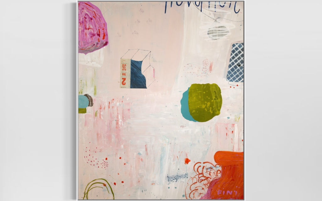
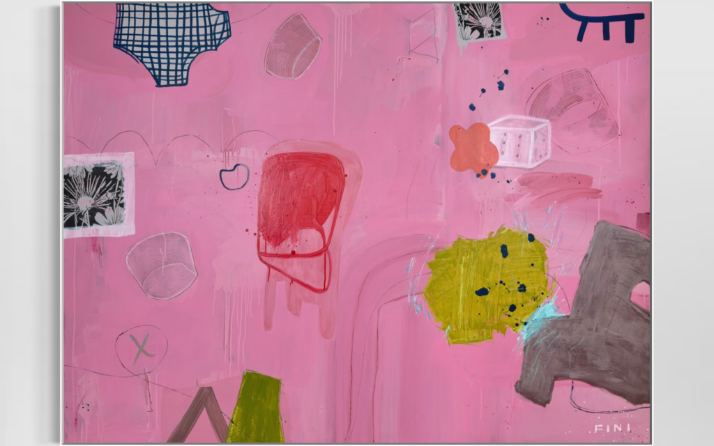
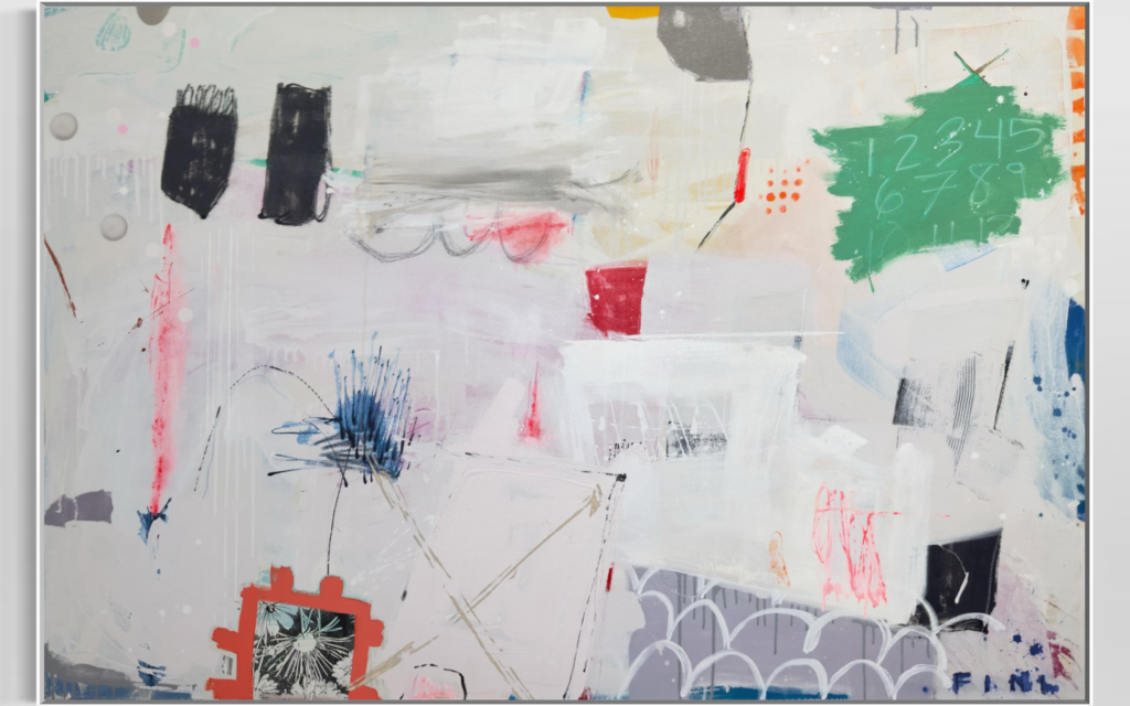
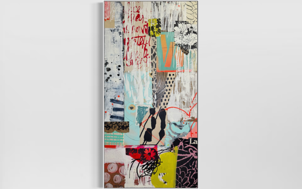
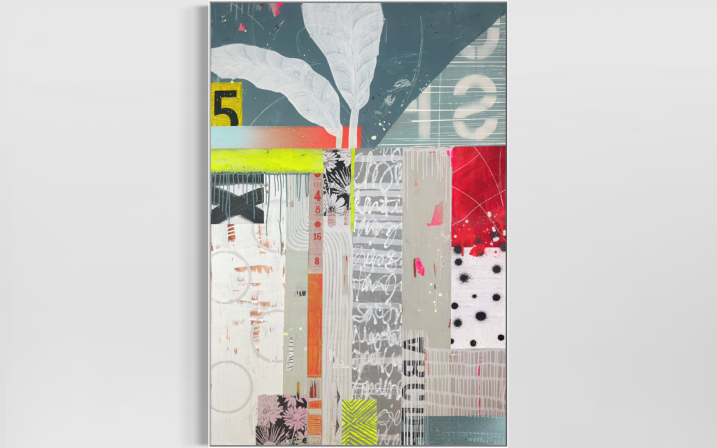
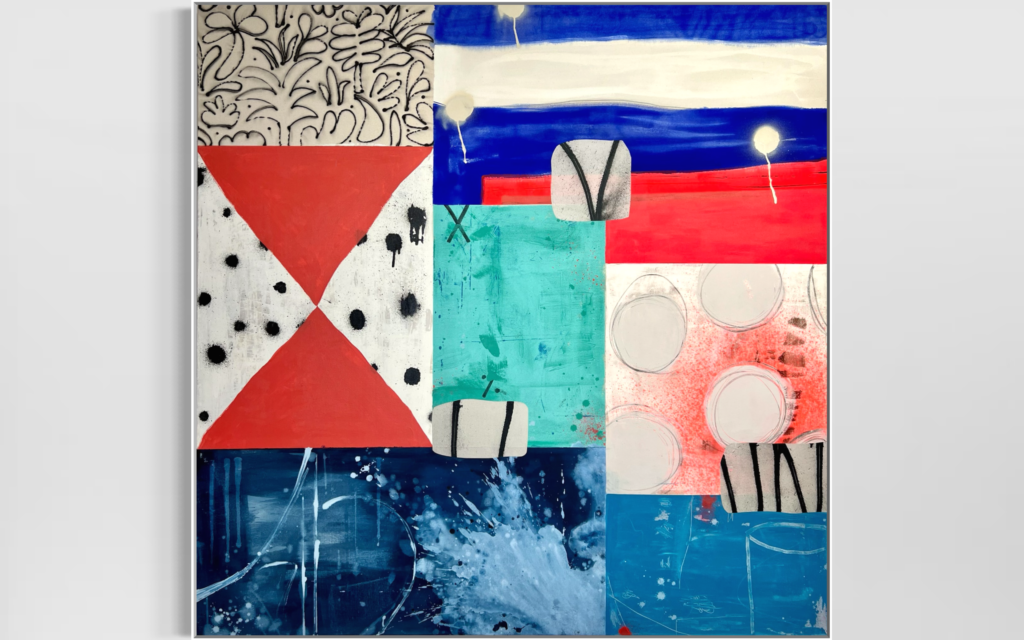
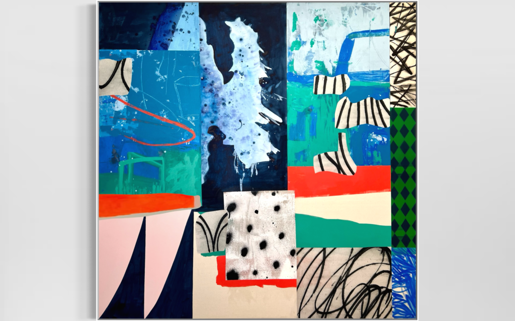
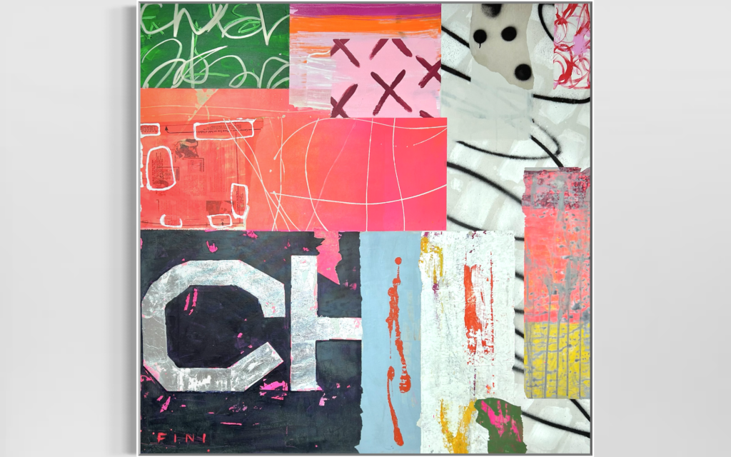
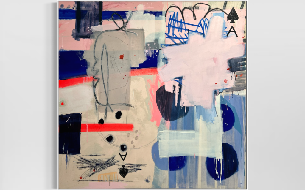
At the heart of Sarah Finucane’s art is a devotion to process as discovery. Rather than following a set plan, she begins with movement—gesture guiding direction and material suggesting its own logic. Collage paper, paint, and ink are layered, cut, and rebuilt; earlier traces press through the surface like sedimentary memory. Through cohesive color palettes and tactile depth, Finucane transforms each painting into a visible record of time. Her surfaces do not conceal their making—they reveal it. Viewers sense both the energy of construction and the meditative stillness that follows.
Two Intertwined Languages
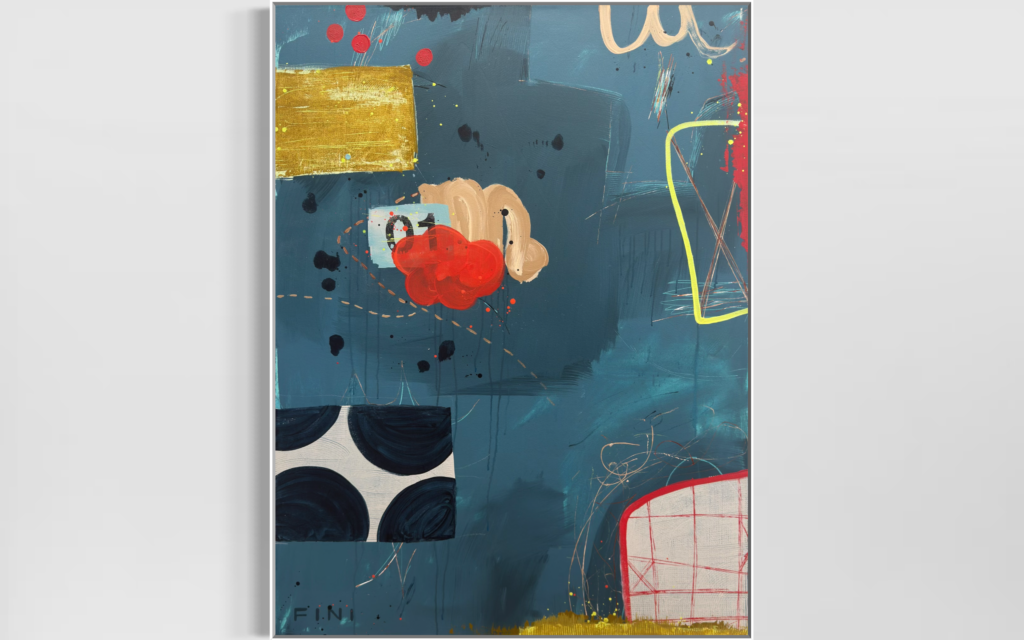
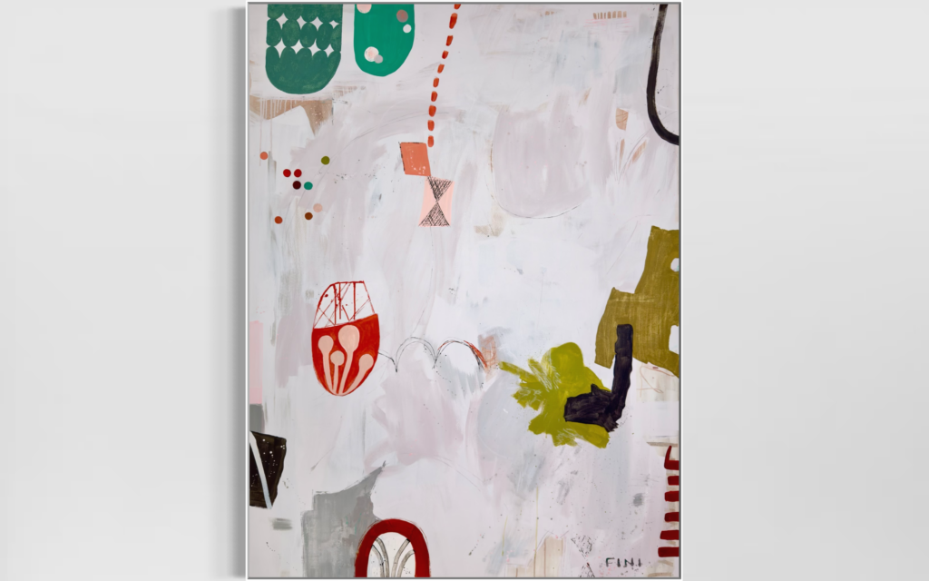
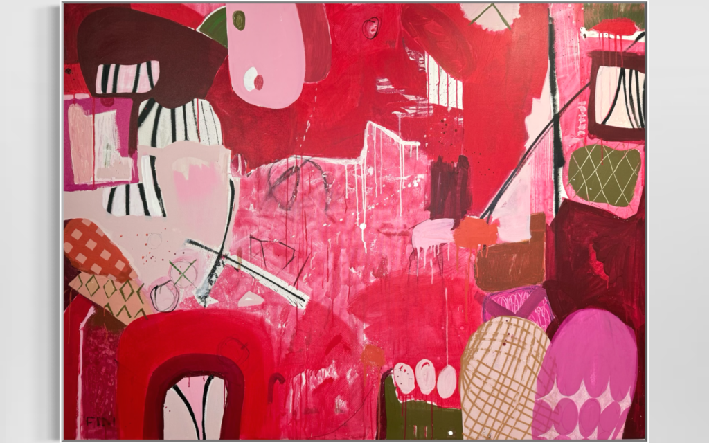
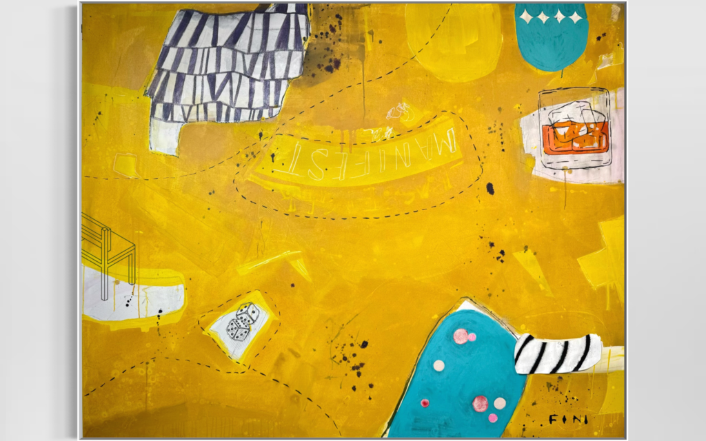
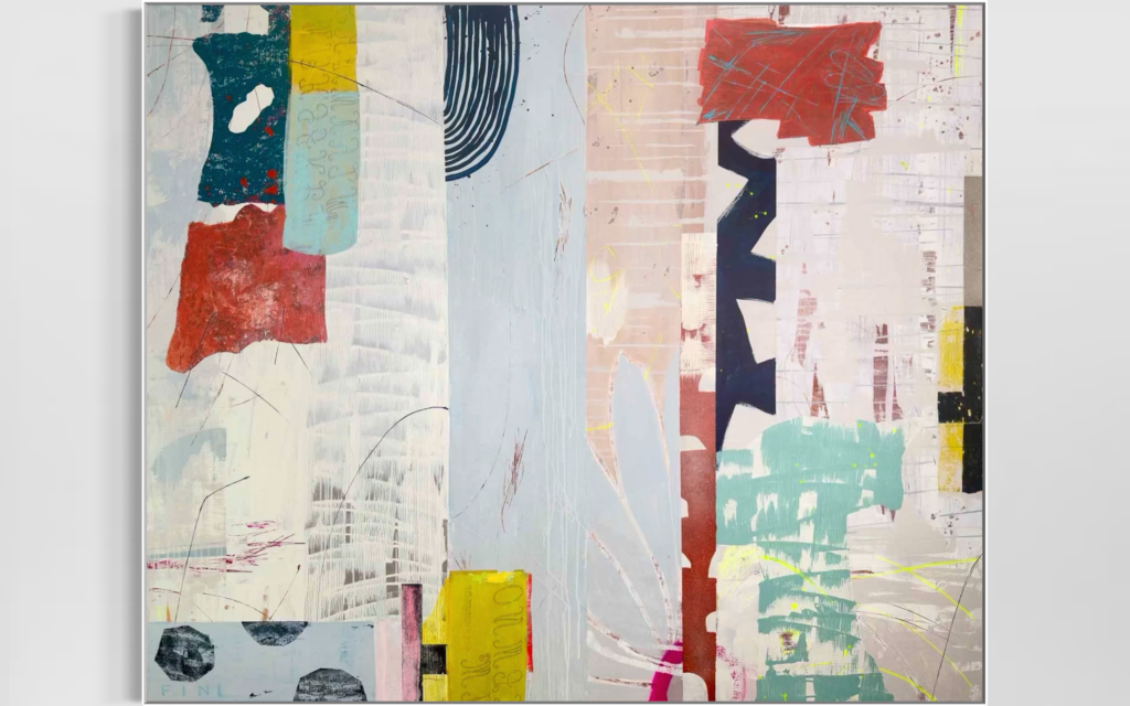
Finucane’s practice engages two distinct yet interconnected vocabularies. The Color Pop series arises from impulse—bold gestures, vivid hues, and textures that materialize from memory and emotion. The Color Block works, however, draw on typographic forms and calibrated grids, exploring how balance and proportion shape perception. Together, these approaches maintain a dialogue between intuition and precision. Her art resists binary categories; it thrives within the tension between spontaneity and structure, intimacy and design.
Where Restraint Meets Expression
Although rooted in abstraction, Sarah Finucane’s work embodies a deep emotional undercurrent. She conveys feeling through rhythm, spatial awareness, and the interplay of density and release. Negative space becomes an active participant, offering contrast and breathing room to the painted gestures that surround it. Without a fixed focal point, her compositions encourage slow looking. Subtle shifts of tone, shadow, and texture unfold gradually—revealing a layered emotional resonance that is both contemplative and architectural.
A Dialogue with Space
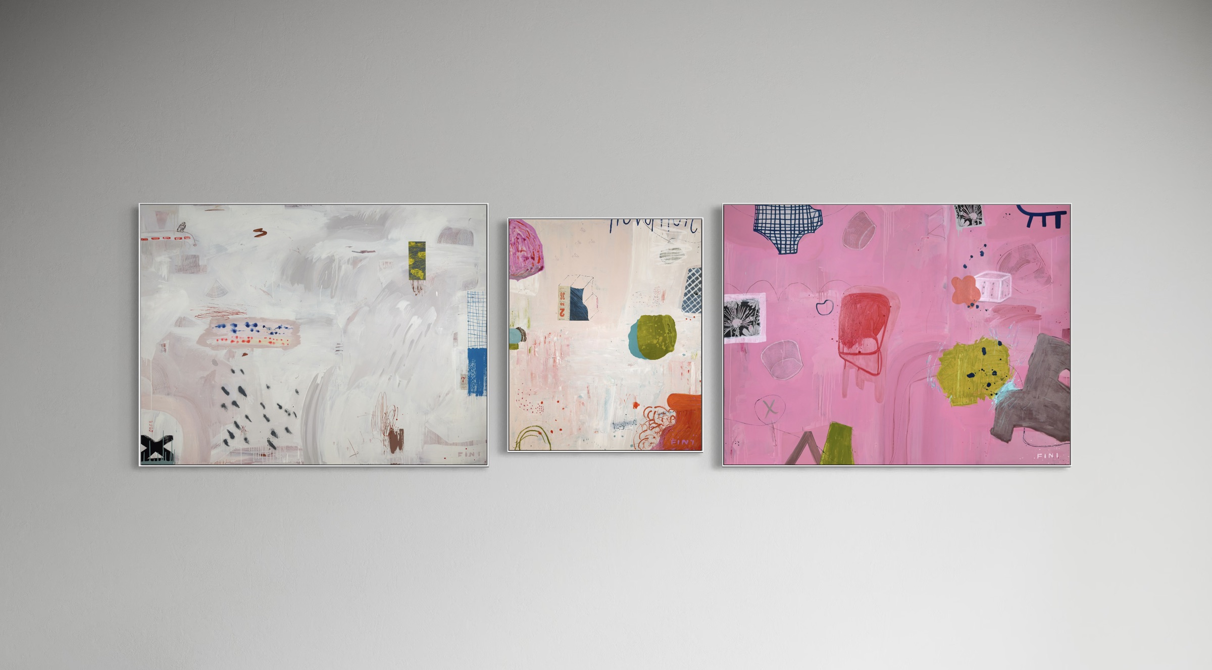
Finucane’s work naturally converses with the spaces it inhabits. Collectors and curators are drawn to how her paintings introduce dimension and warmth while maintaining poised restraint. Their balance invites both intimacy and scale, integrating seamlessly into interiors without ever receding. Her background in product and advertising design refines her instinct for proportion and spatial tension. Whether featured in British Vogue or curated by Anthropologie, her paintings sit elegantly at the intersection of contemporary art, design culture, and lived environment. Ultimately, Sarah Finucane’s work proves that abstraction need not obscure meaning. Instead, it allows meaning to surface—emerging slowly through repetition, gesture, and the tactile language of material itself.
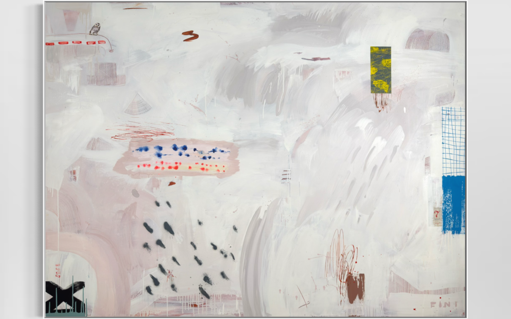
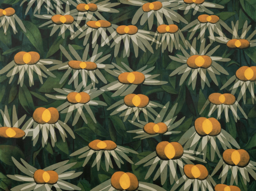
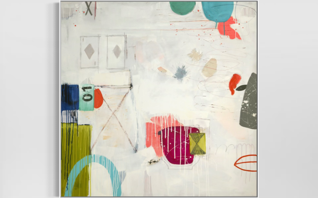
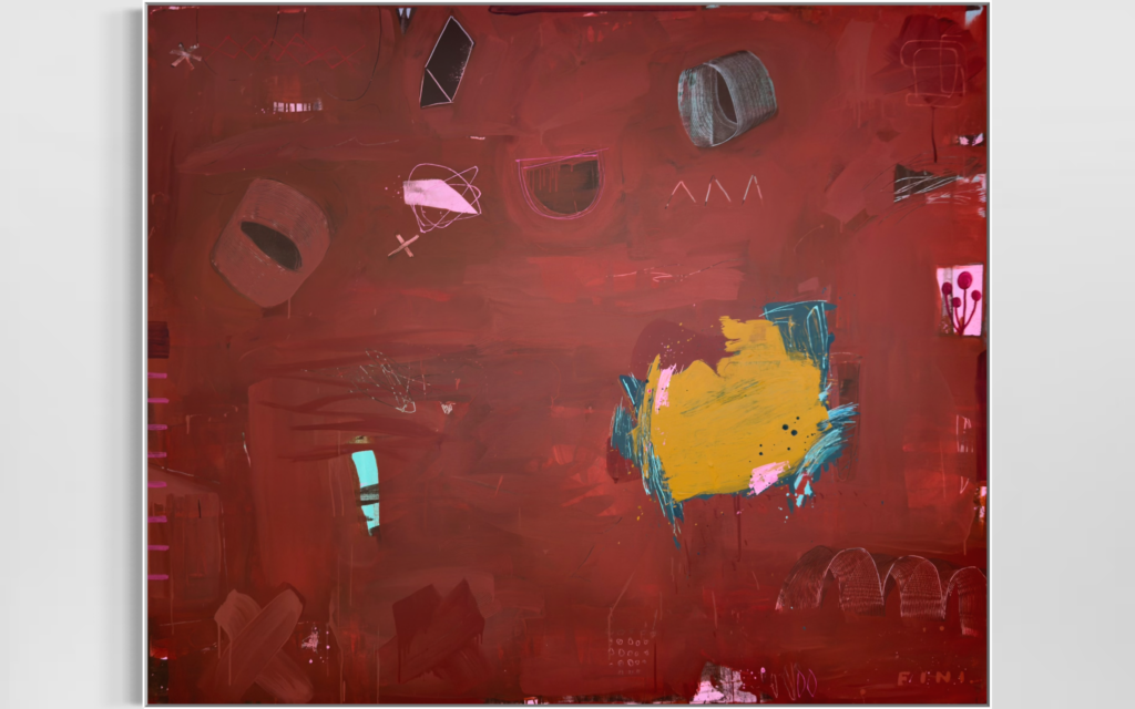
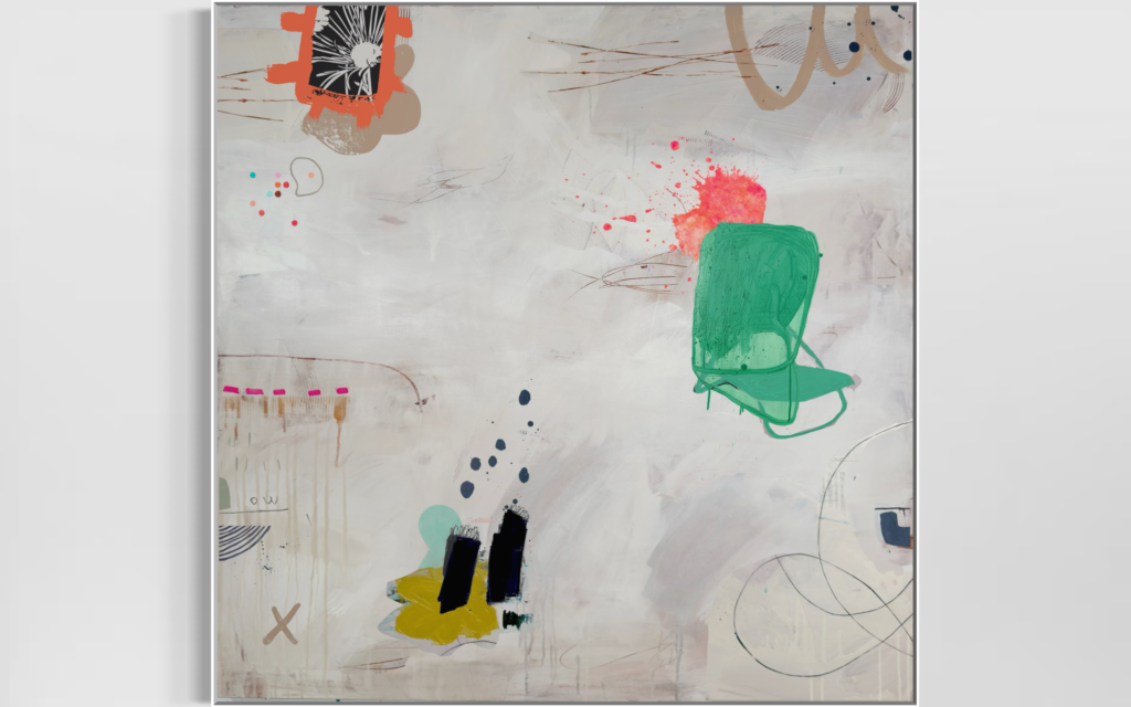
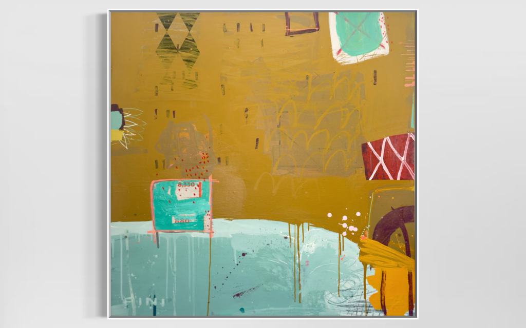
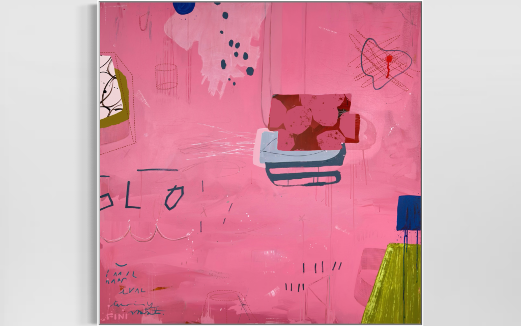
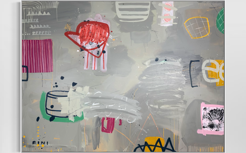
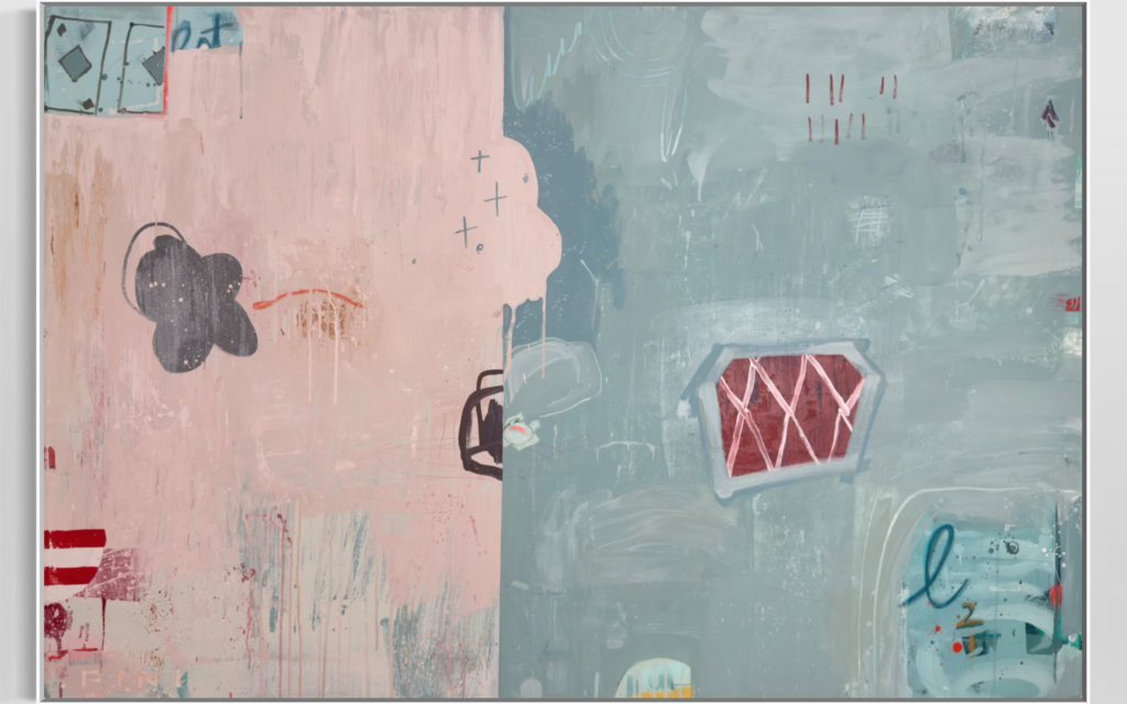
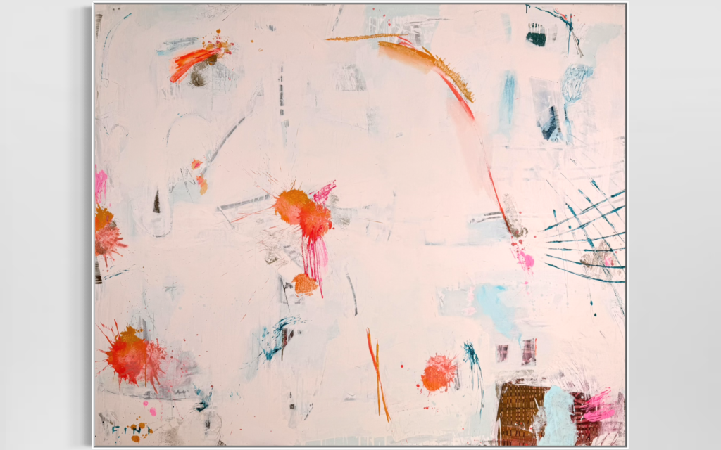
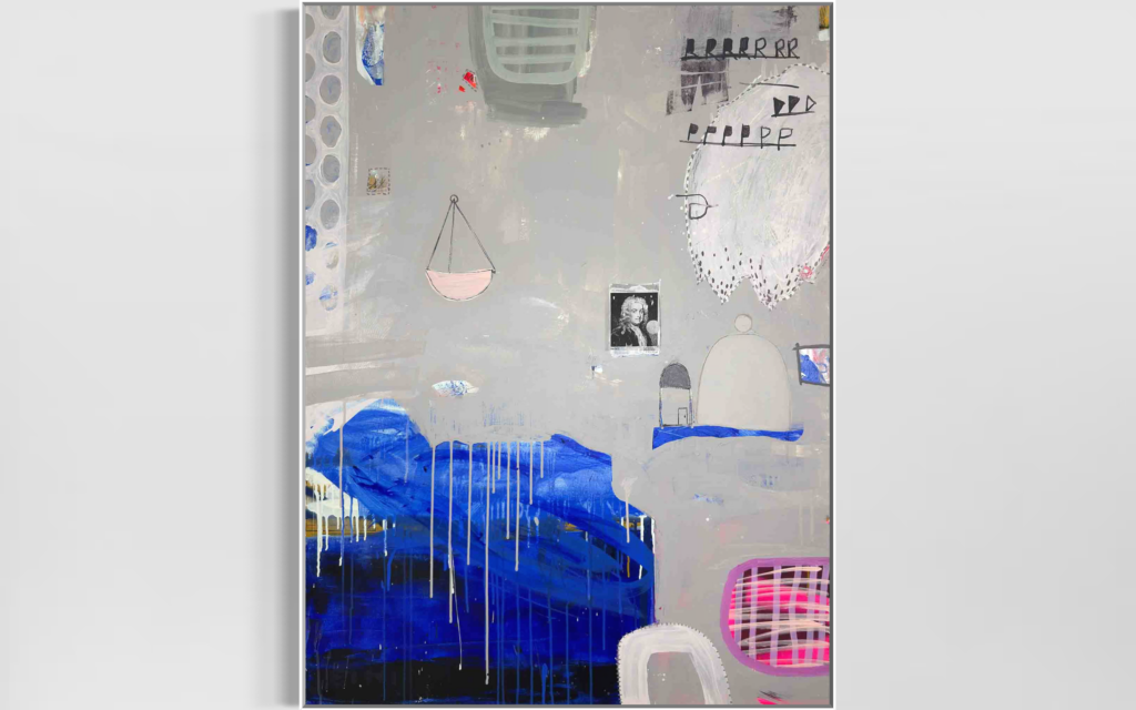
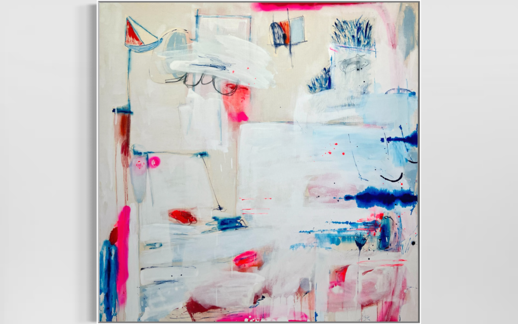
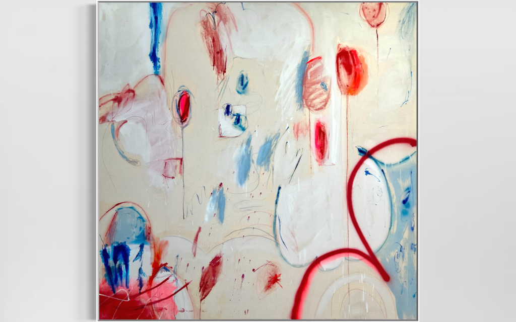
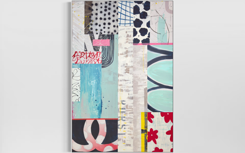
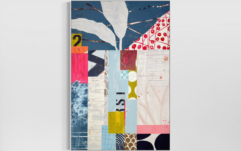
Color Pop Series
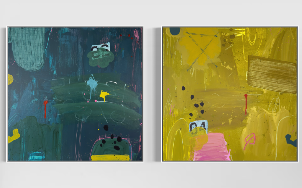
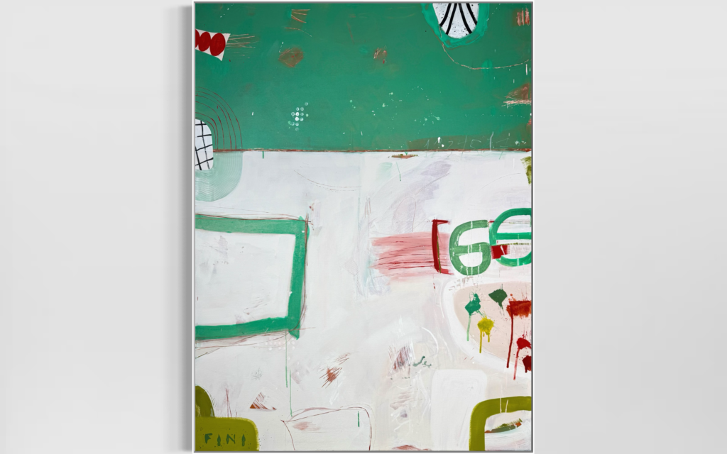
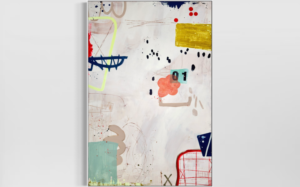
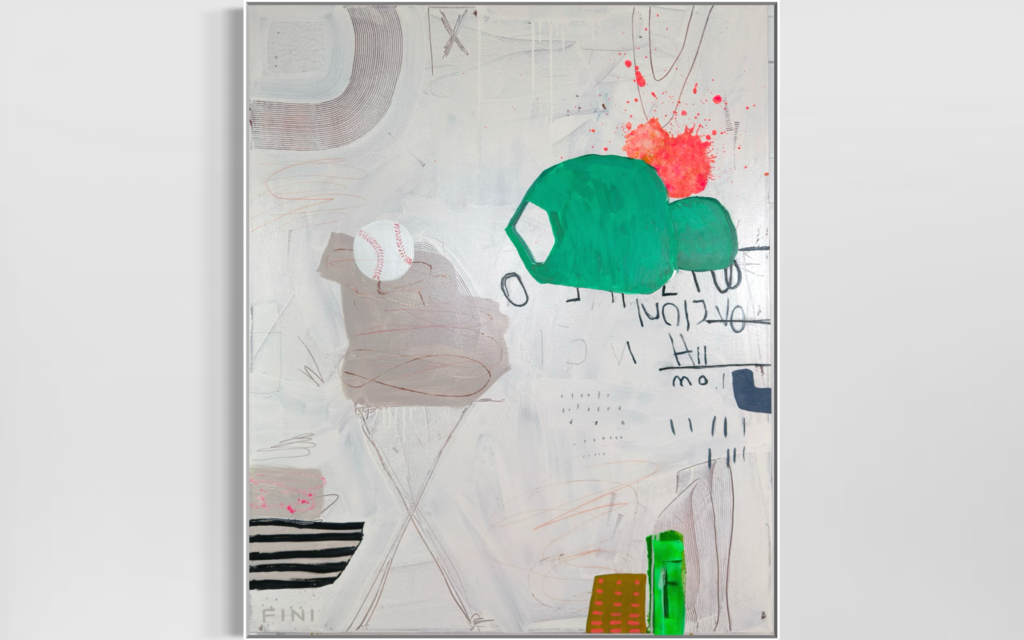
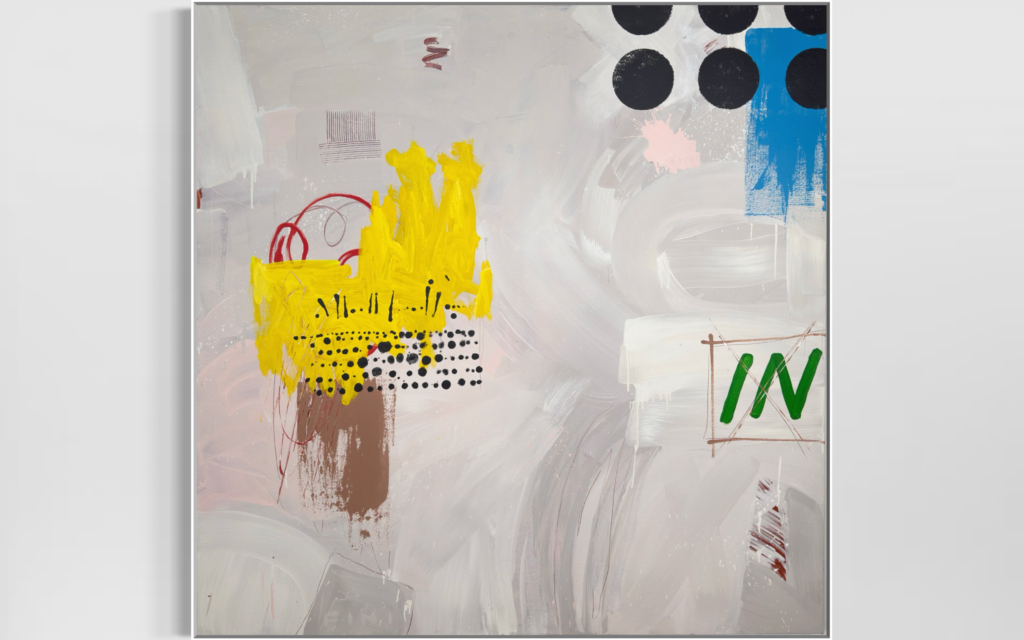
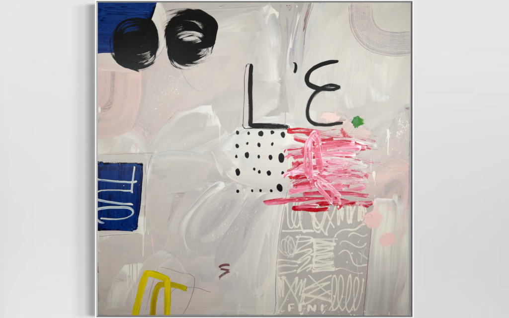
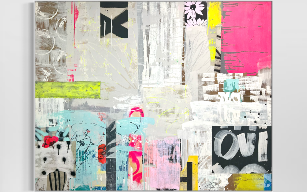
Color Block Series
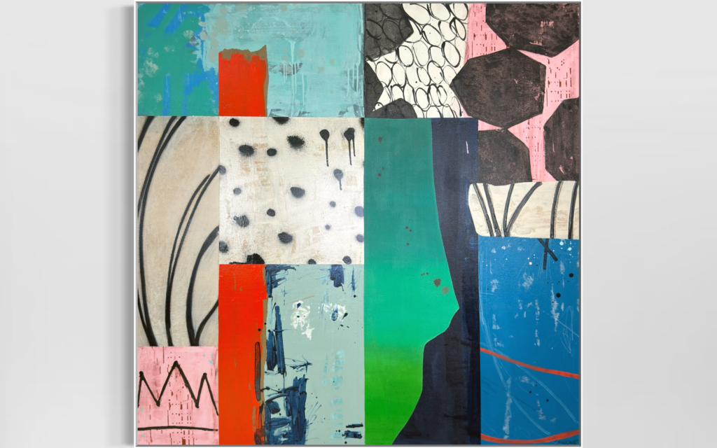
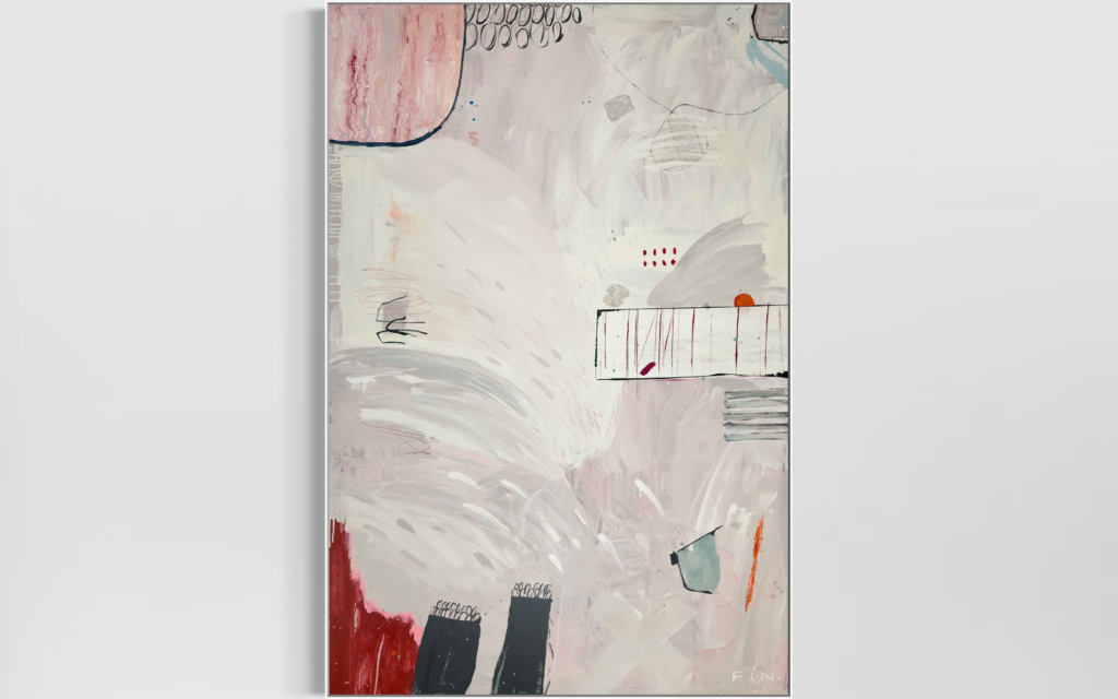
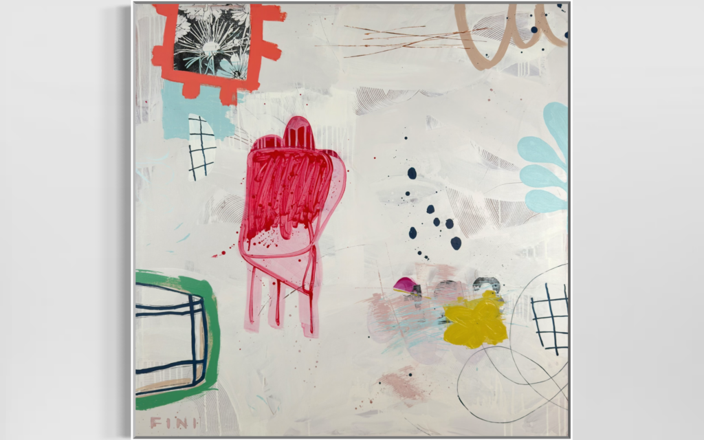
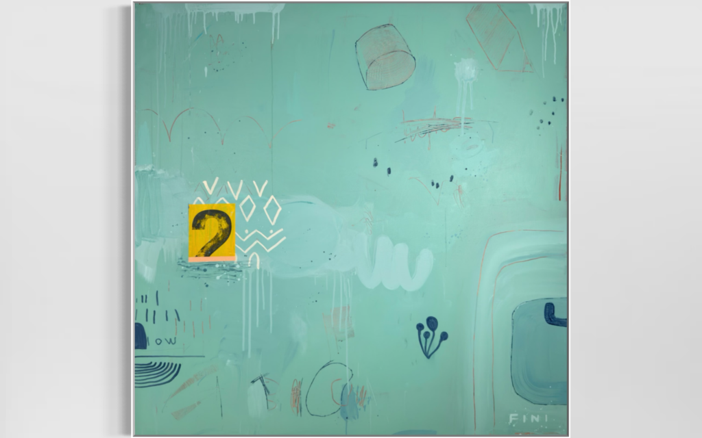
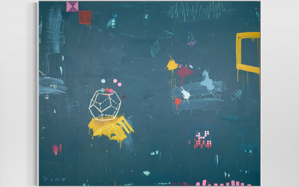
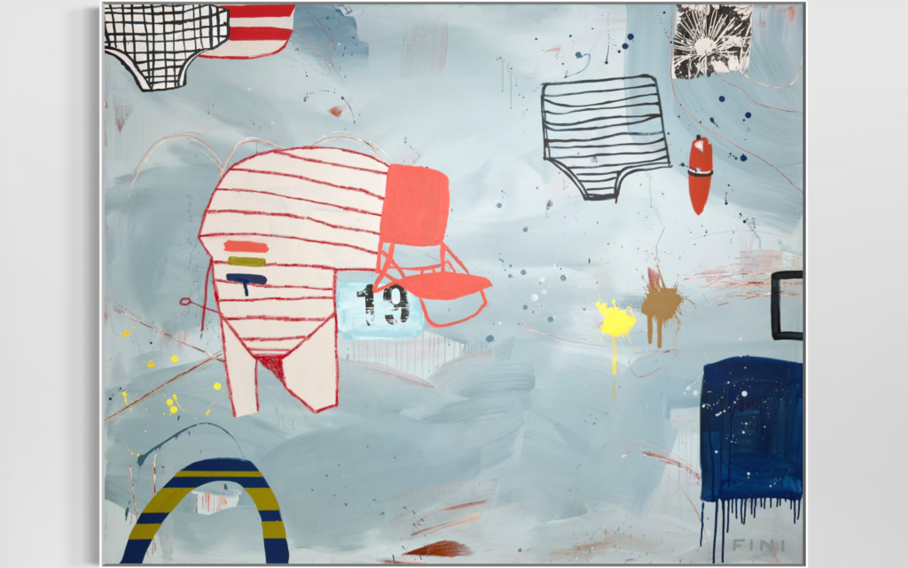
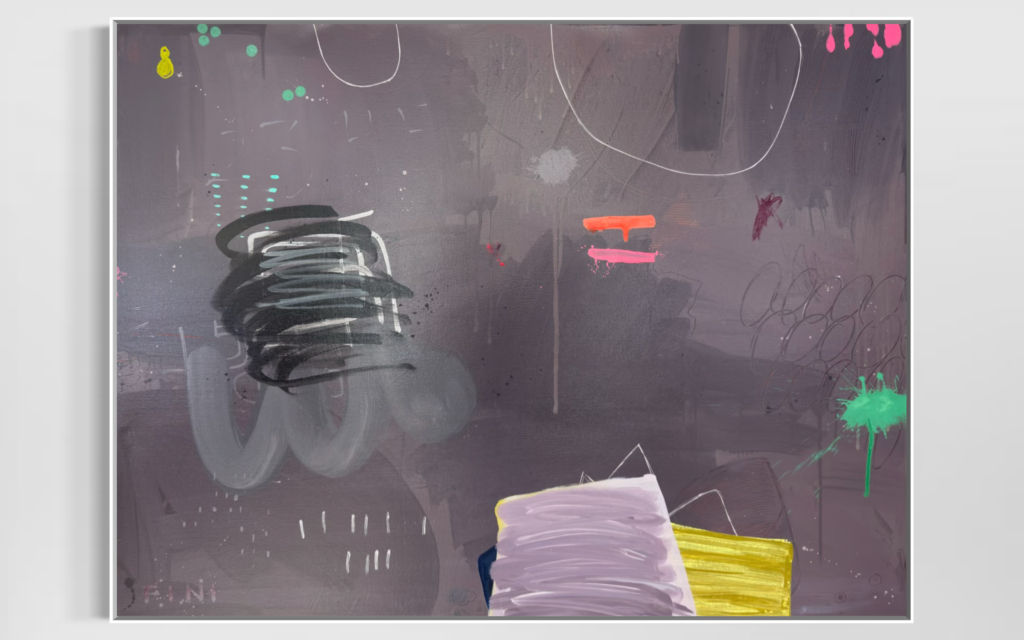
Velvet Edge